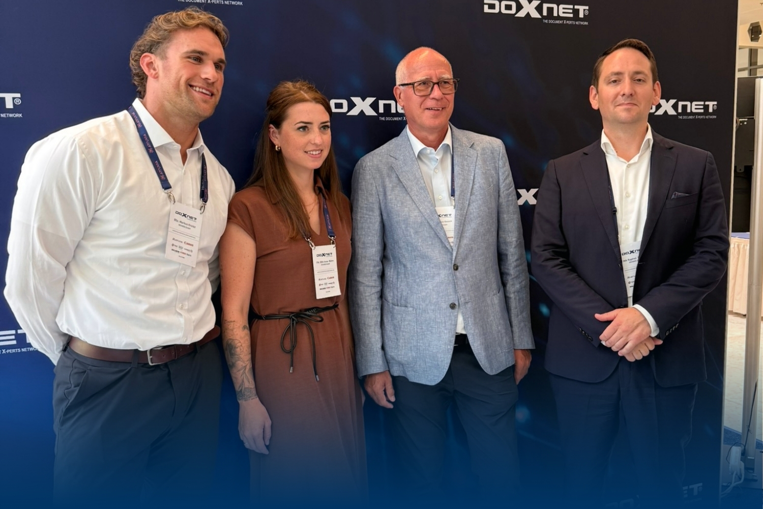
Rebranding at INVARIS: Shaping Customer Communication
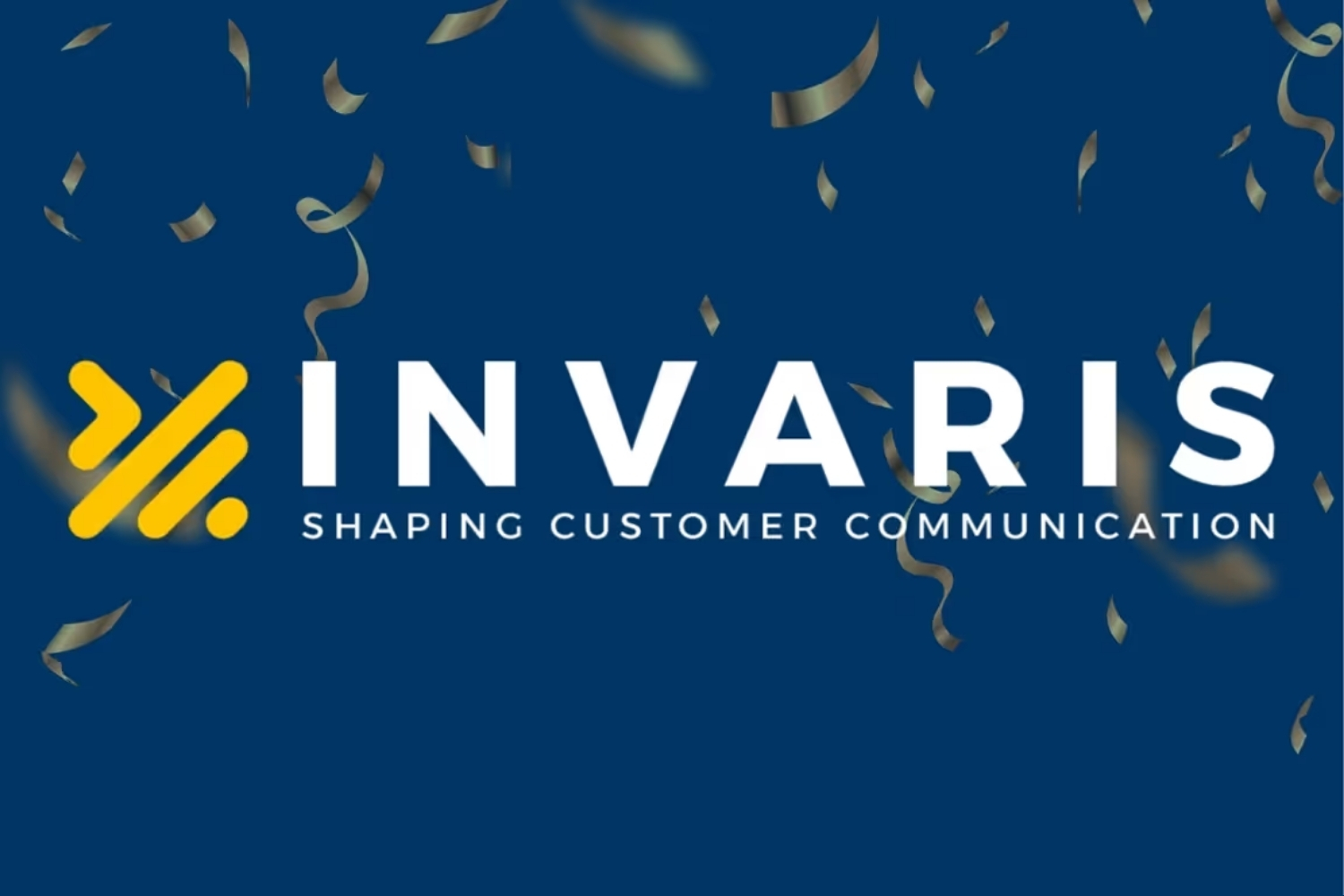
Brands don't just show what they look like. They show how they think. With the relaunch of its corporate identity, INVARIS is making visible what has shaped daily work for years: the aim of organizing complex systems and structuring established communication landscapes more clearly.
Design as a reflection of working methods
The focus of the redesign was not on the desire for a more modern appearance, but on greater precision. Logo, typography and design elements were reworked to make orientation, structure and systematics more clearly visible.
The new logo is deliberately open. It allows different ways of reading: For some, it stands for order in the document and communication environment, for others, it refers to code, modular systems or technical architecture. This ambiguity is not a side effect, but part of the concept. It addresses the tension in which customer communication takes place today — between professional proximity and technological depth.
Shaping customer communication
As a development company, change is not a state of emergency for INVARIS. Solutions are being thought through, structures are being adapted, requirements are being rearranged. The new brand identity follows the same logic. It is not a break with the past, but a consistent continuation of what has already become established.
The new slogan Shaping Customer Communication sums up this claim. It not only describes what we do, but also how we understand it: designing communication consciously, organizing complexity and building systems in such a way that they function reliably over the long term.